Configuring Reports
Selecting Issues
The Search bar is the main control used to select the Jira projects and issues to be included in your report.
The Search bar can be used in two different modes, identified by the two tabs above the text input region. Which mode is selected determines the type of text you will enter in the Search text box.
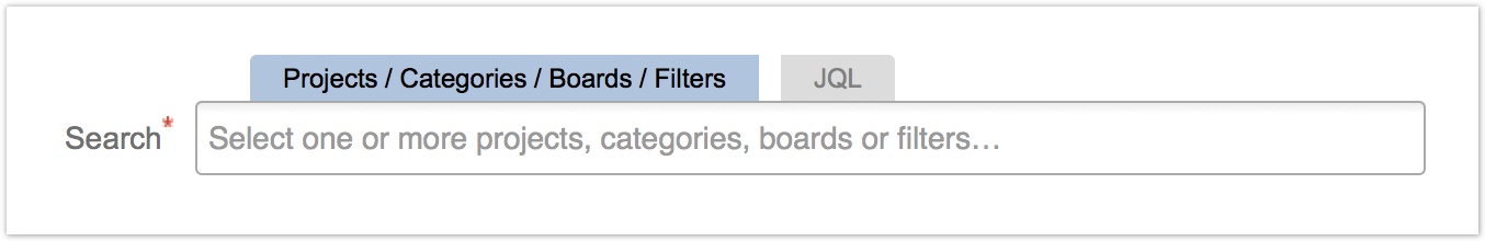
With the tab labeled Projects / Categories / Boards / Filters selected, you can quickly select the projects, project categories, Jira Software boards and saved Jira filters of interest from a dropdown list.
Switch to the JQL tab if you wish to directly enter an advanced Jira Query Language (JQL) search instead.
Dataplane's search bar was specially designed to provide fast and intuitive Jira issue selection across the spectrum of Jira users in your organization, including:
- new and casual Jira users who are familiar with just the basics of their team's projects and issues,
- regular Jira users who work with multiple projects, understand project categories, and have defined their own Jira search filters for qualified issue review, and
- Jira power users who do advanced searches in the Jira Issue Navigator and craft sophisticated Jira Query Language (JQL) statements for complex searches.
The red asterisk (" * ") next to the search bar indicates that it is a required entry for every report.
Using the Projects, Categories, Boards and Filters Selector
Dataplane Reports' default search option provides a direct, dropdown selection of one or more projects, project categories, Jira Software boards, or Jira issue filters. The Projects / Categories / Boards / Filters tab over the search box will be highlighted in blue when using this type of search.
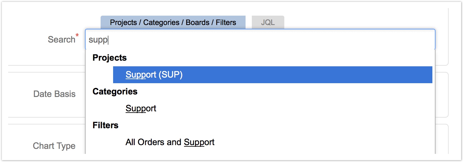
To make a selection, click the text box to open a dropdown list of all Jira projects, project categories, Jira Software boards, and Jira issue filters. You can also start typing the first few characters of the project/category/board/filter name if you already know it. While typing, Dataplane suggests matching options from the dropdown list to match the text being typed.
For instance, in the example below, the user wants to report on their "Support" project and starts typing s u p p. This displays the following matches in their Jira instance, including a project, a project category, and a handful of filter options. Note that the text typed by the user must appear at the start of a matching word in the project, category, or filter. For example, typing "supp" will match "Support", but "port" will not.
You can select multiple projects, project categories Jira Software boards, or Jira issue filters to be reported on at once.
You may even mix and match between these types of selections. In the example below, the user has selected a report based on a saved filter named "Assigned to Me - No Due Date", which is augmented by all issues from a selected project.

You will quickly come to love the flexibility of these Dataplane Reports searches, allowing effortless cross-project and cross-category reporting.
Advanced Issue Selection with JQL
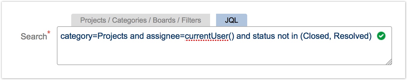
For advanced users and more sophisticated searches, click on the JQL search tab to enter a search statement for your report using Jira Query Language (JQL).
This JQL text entry box works exactly like Jira's Advanced Search JQL box in the Jira Issue Navigator, including auto-complete and on-the-fly syntax checking.
If you are unfamiliar with building a query using JQL, Atlassian provides a good primer on JQL syntax.
The auto-complete feature will serve up options for existing projects, categories, and filters as well as more advanced JQL syntax for compound statements and the like.
Here are some commonly-used JQL queries to try:
Selecting by Project:
project = "Acme Inc. Services"
project in ("Acme Inc. Services", "ClientCo Media Work", "Service Concepts")
Selecting by Project Category:
category = Products
category in (Products, Ops, Support)
Selecting by Saved Filter:
filter = "Open Issues - Assigned to Me"
Selecting with More Advanced, Compound Statements:
project = "Acme Inc. Services" AND assignee = "Thomas Jefferson" AND resolution is EMPTY
category in (Products, Ops, Support) AND affectedVersion in ("0.9.0", "0.9.1")
Selecting Dates and Reporting Intervals
Many reports in Dataplane are historic, meaning that they evaluate the past state of Jira issues in your system, while other reports operate on the current state of issues.
Start Date and End Date
For historic reports, the Start Date and End Date controls allow you to select a specific date range over which to report data. If you supply a Start Date but leave the End Date blank, the end date of the report will automatically default to the end of the current day, week, month, quarter, or year (depending on the value of the Interval control).
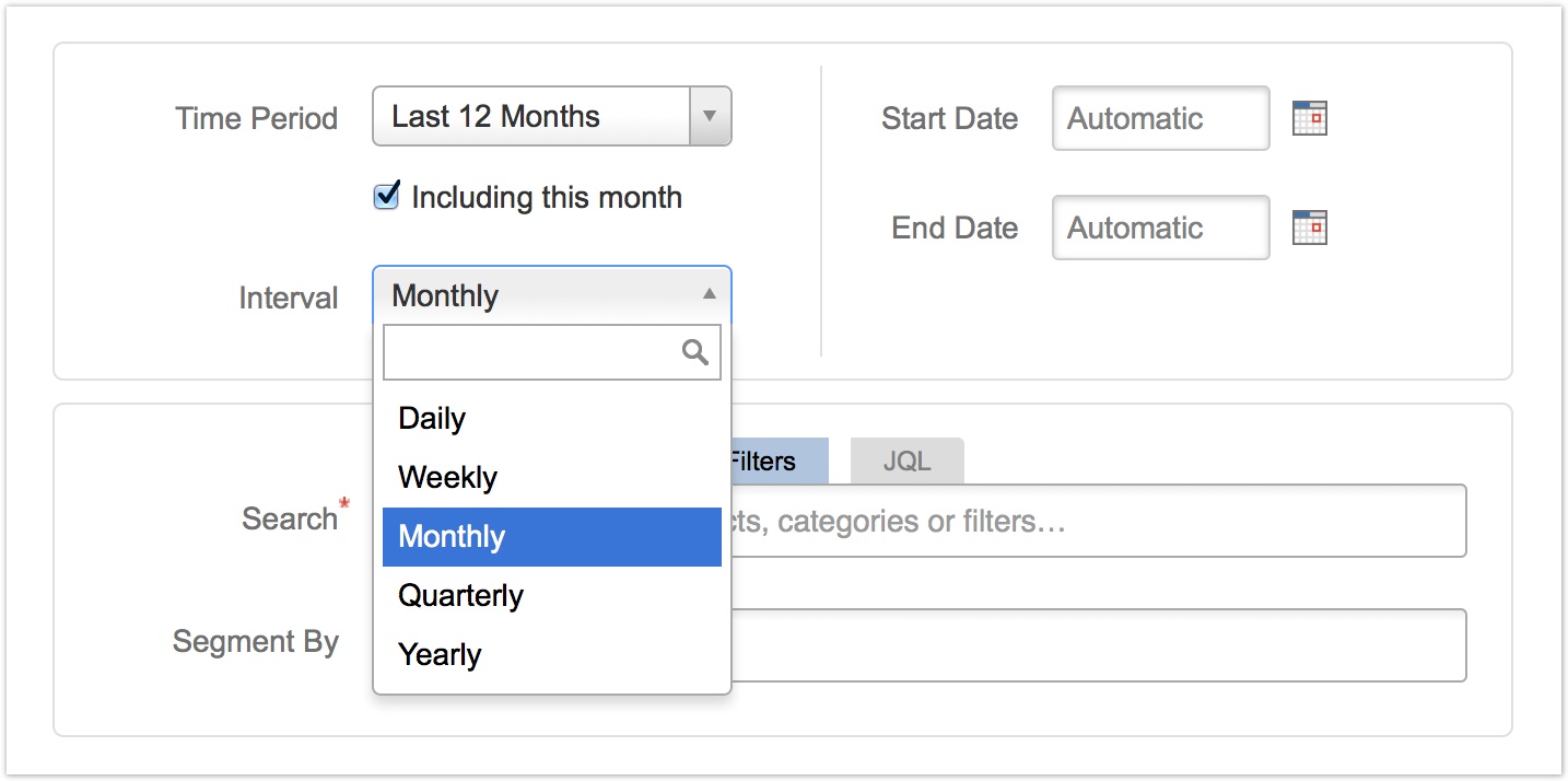
Interval
The Interval control controls whether the results will be aggregated on a daily, weekly, monthly, quarterly, or annual basis. Instead of selecting from the dropdown, you can also use the keyboard to type the first few characters of the option to select it.
Time Period
Instead of specifying an explicit Start Date and End Date, you can also use the automatic period control to select a range of dates relative to whenever the report is run. For example, you could select a period of "Last 12 Months" or "Last 4 Weeks" to include results from the indicated period.
The automatic date ranges available in the period control are:
| Year-Based | Quarter-Based | Month-Based | Week-Based | Day-Based |
|---|---|---|---|---|
| This Year | This Quarter | This Month | This Week | Last 7 Days |
| Last Year | Last Quarter | Last Month | Last Week | Last 14 Days |
| This Year to Date | Last 3 Months | Last 4 Weeks | Last 30 Days | |
| Last 12 Months |
To use an automatic date range, you can select it from the dropdown, or you can also use the keyboard to type a partial match of the option name. For example, typing "last w" can be used to select the Last Week option, and typing "this q" will select the This Quarter option.
Other date ranges can be entered by selecting the Custom option (or by simply specifying a value in the Start Date and End Date controls).
Including this Month/Week/Day
The Including this Month and related checkboxes automatically appear when you have selected any of the "Last xx Months", "Last xx Weeks" and "Last xx Days" intervals. By default, this checkbox is enabled, telling Dataplane to include the current interval in the report.
For example, assume that today's date is May 15 2015 and you run a monthly report with a period of "Last 12 Months". If you enable the "Including this month" checkbox, the report date range would include June 1 2014 to May 31, 2015. Instead, if you disable the checkbox, the report date range would be May 1 2014 through Apr 30, 2015.
Filtering Report Results
Filtering by Historical Status
Some reports include the ability to filter issues based on their historical status at a specific point in time in the past. The primary reports that include this feature are the Issue Values by Date report, the Issue Values Snapshots by Date report, and the Issue Values Snapshots Sum by Date report. These reports include a Status to Include control, as shown below:
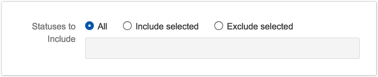
This control allows the user to automatically include or exclude issues based on their historical status at each time interval plotted on the chart.
The All option is selected by default and will include issues in all statuses in each reporting interval.
By selecting the Include selected control and entering one or more statuses in the text input box, Dataplane will only plot an issue if the issue was in one of the entered statuses at the start of the reporting interval. For example, to show only issues newly created at the start of a week, select "Include selected" and enter "Open" in the text box.
By selecting the Exclude selected control and entering one or more statuses in the text input box, Dataplane will plot all issues except those in one of the entered statuses at the start of the reporting interval. For example, this can be useful to exclude issues that were waiting for a customer or vendor response.
Filtering Out Zero Values
A Results to Include report configuration option is available for historical (date-based) reports. Selecting Only non-zero values will exclude report results that have zero issues (or a zero value, for reports that sum numeric fields) from the result data tables.
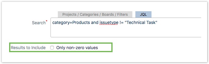
Report charts are not affected by this option, although if the Average statistic value is displayed with the report chart, its value may change since Dataplane will now only consider non-zero intervals when calculating that average.
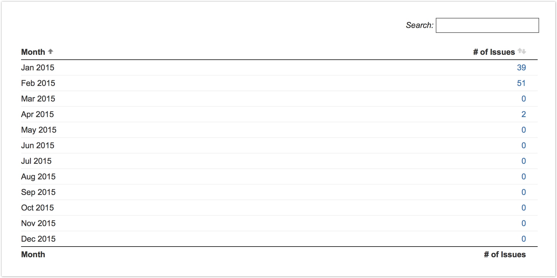
When Only non-zero values are not selected, the report data table might appear as follows:
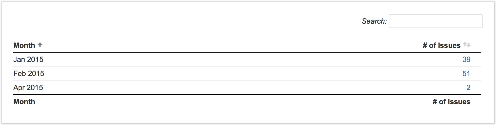
With Only non-zero values selected, that same data table would exclude all zero-valued results:
Configuring the Chart Type
The Chart Type control allows users to configure the rendering of the output chart:

Depending on the specific report type selected, different chart-type options may be available.
For current-value reports, including the Current Issue Values report as well as other reports in the Current Metrics category, the following chart types are available:
| Bar Chart | Segmentations are stacked horizontally across each bar. | |
| Grouped Bar Chart | Segmentations are shown as groups of distinct, non-stacked horizontal bars. | |
| Normalized Bar Chart | Each bar in the chart is normalized to 100%, and then segmentations are shown with relative percentages in each bar. | |
| Vertical Bar Chart | Segmentations are stacked vertically along each bar. | |
| Vertical Grouped Bar Chart | Segmentations are shown as groups of distinct, non-stacked vertical bars. | |
| Normalized Vertical Bar Chart | Each bar in the chart is normalized to 100%, and then segmentations are shown with relative percentages in each bar. | |
| Pie Chart | Each segmentation in the chart is shown as an individual pie segment. | |
Multiple Pie Chart | For the Current Issue Values report, the first Segment By option is used to divide each segment into a specific pie chart, and the subsequent Segment By options are used to divide the segments within the individual pie charts. For other reports in the Current Metrics category, the key metric is used to divide the segment into a specific pie chart. For example, in the Current Affects Version report, each Affects Version will have its pie chart, just in the Current Assignees report, each Assignee will have its pie chart. |
For historical reports, the following chart types may be available, depending on the report type:
| Column Chart | Segmentations are stacked vertically in each bar. | |
| Grouped Column Chart | Segmentations are shown as groups of distinct, non-stacked vertical bars. | |
| Normalized Column Chart | Each bar in the chart is normalized to 100%, and then segmentations are shown with relative percentages in each bar. | |
| Line Chart | Each segmentation is plotted as a distinct line. | |
| Range Chart | Each segmentation is plotted as a distinct line. The minimum and maximum values for each segmentation are also used to color the background area behind each line. | |
| Area Chart | Each segmentation is stacked on top of other segmentations. |
Segmenting Results
Most reports provide the ability to segment (or break down) the results in the report chart and data table using the "Segment By" report option. Segmentation lets you group results by the value of one or more Jira issue fields or properties.
Click in the Segment By select box to open a dropdown list of all possible segmentations, or just start typing if you already know the name of the field you are looking for. You may select any number of segmentations. The more options selected, the more fine-grained your results data breakdown will be.
You can reorder the selected segments at any time by just dragging and dropping the segments in the Segments By field.
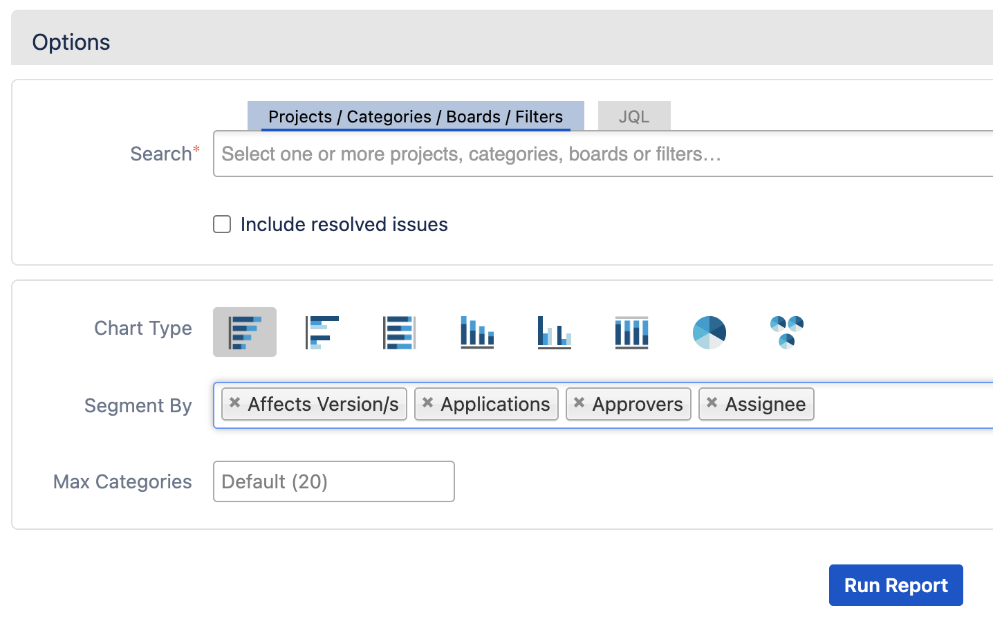
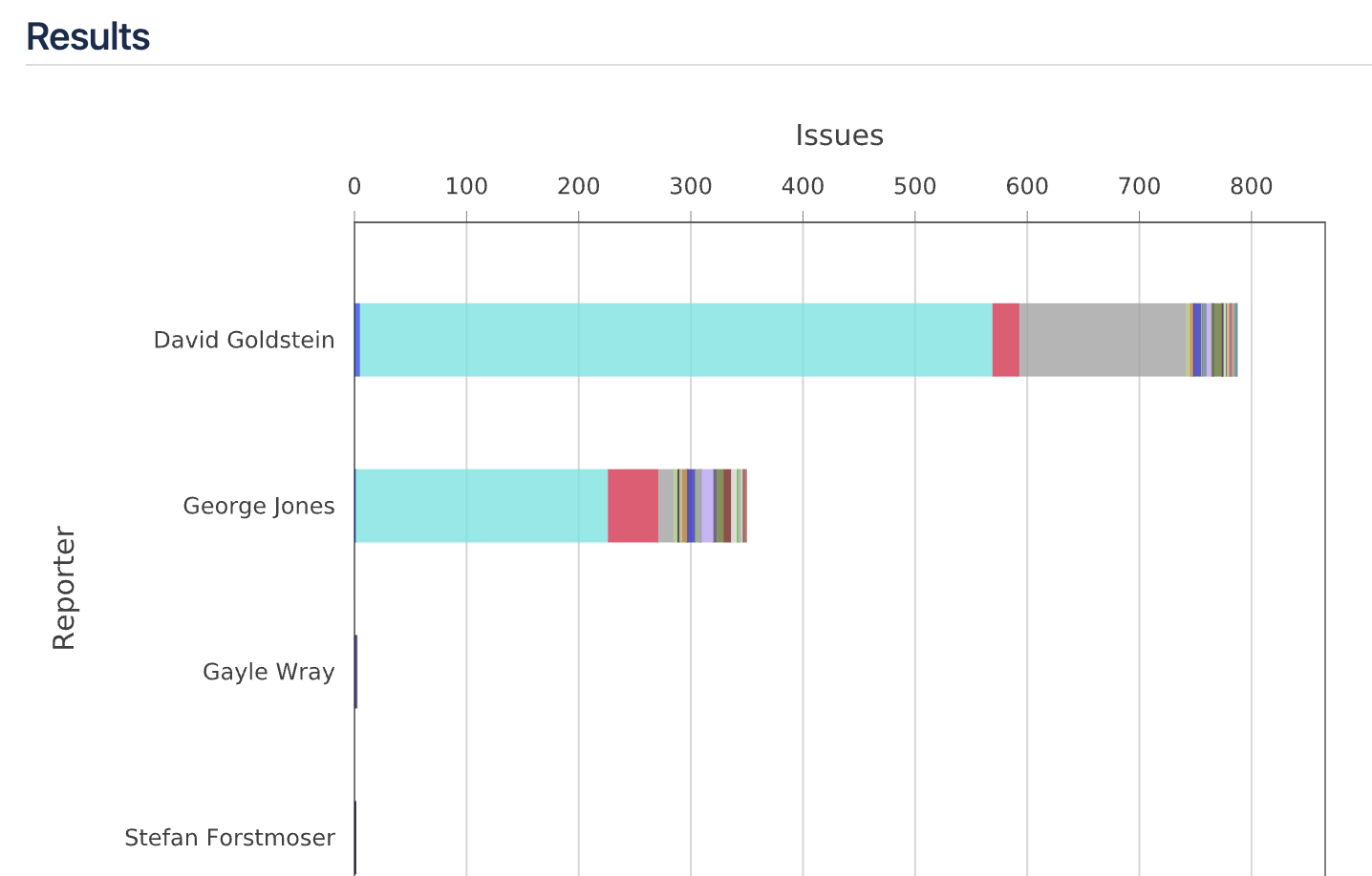
When you run the report, the result shows data broken down by Reporter, Affects Version/s, Applications, Approvers, and Assignee, as shown:
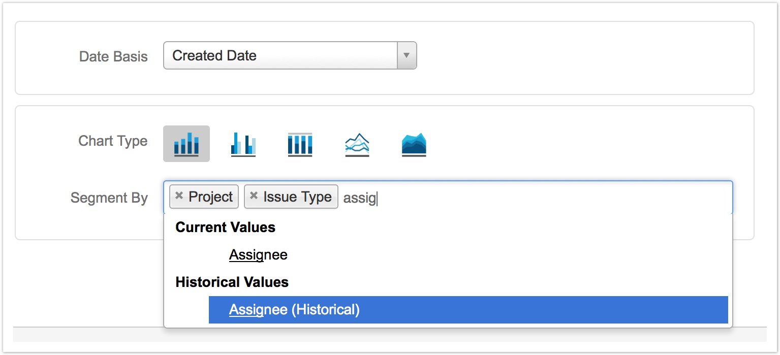
For historical reports, segmentation can be performed in one of two manners for any given issue field or property of interest: based on the current value of the issue field, or based on a past/historical value of the field. The value in the first section of the dropdown, Current Values, shows the current value of the issue field. To segment by a historical value, select that field's (Historical) derivative in the Historical Values section of the dropdown. Note that historical values are not supported in all reports or for all field types.
For example, suppose that you are using Dataplane Reports to display a report of issues created by date, segmented by the assignee. If you ask Dataplane Reports to simply segment by assignee, it will group the issues in the output based on each issue's current assignee. However, if you ask it to segment by the historical assignee, it will group the issues based on the assignee that the issue had at the beginning of each selected interval.
Managing Table Columns
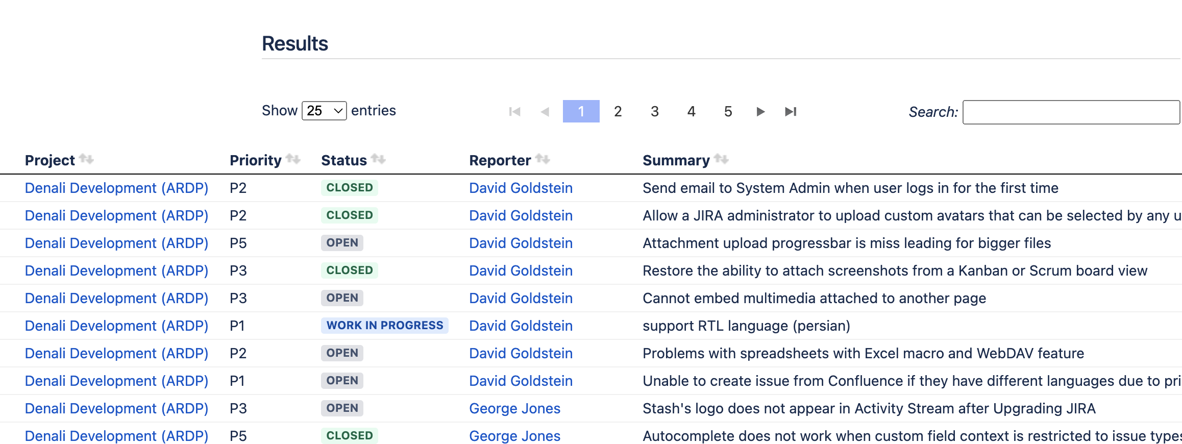
The Issue Table report gives you the ability to select the columns for your table and the order in which you want the columns to be displayed.
The columns show the results by the value of one or more Jira issue fields or properties.
To change the order of the column, in the Columns field, drag and drop the selected columns.
.png?version=1&modificationDate=1706698333051&cacheVersion=1&api=v2)
When you run the report, the result shows data organized by Project, Priority, Status, Reporter, Summary, and Issue Type (the columns you selected in the order you specified), as shown:
You can save the report for future use.
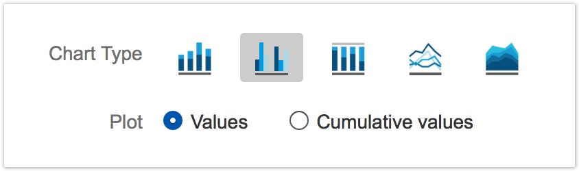
Plotting Standard or Cumulative Values
Some reports, such as Issues Entering Status by Date, provide the option to display regular interval values or cumulative values. By default, the Values radio button is selected and the regular values for each reporting interval are plotted. To plot cumulative values instead, select the Cumulative values radio button.
When Cumulative values is selected, the data table shown on the Data results tab includes columns for both cumulative and regular interval values.
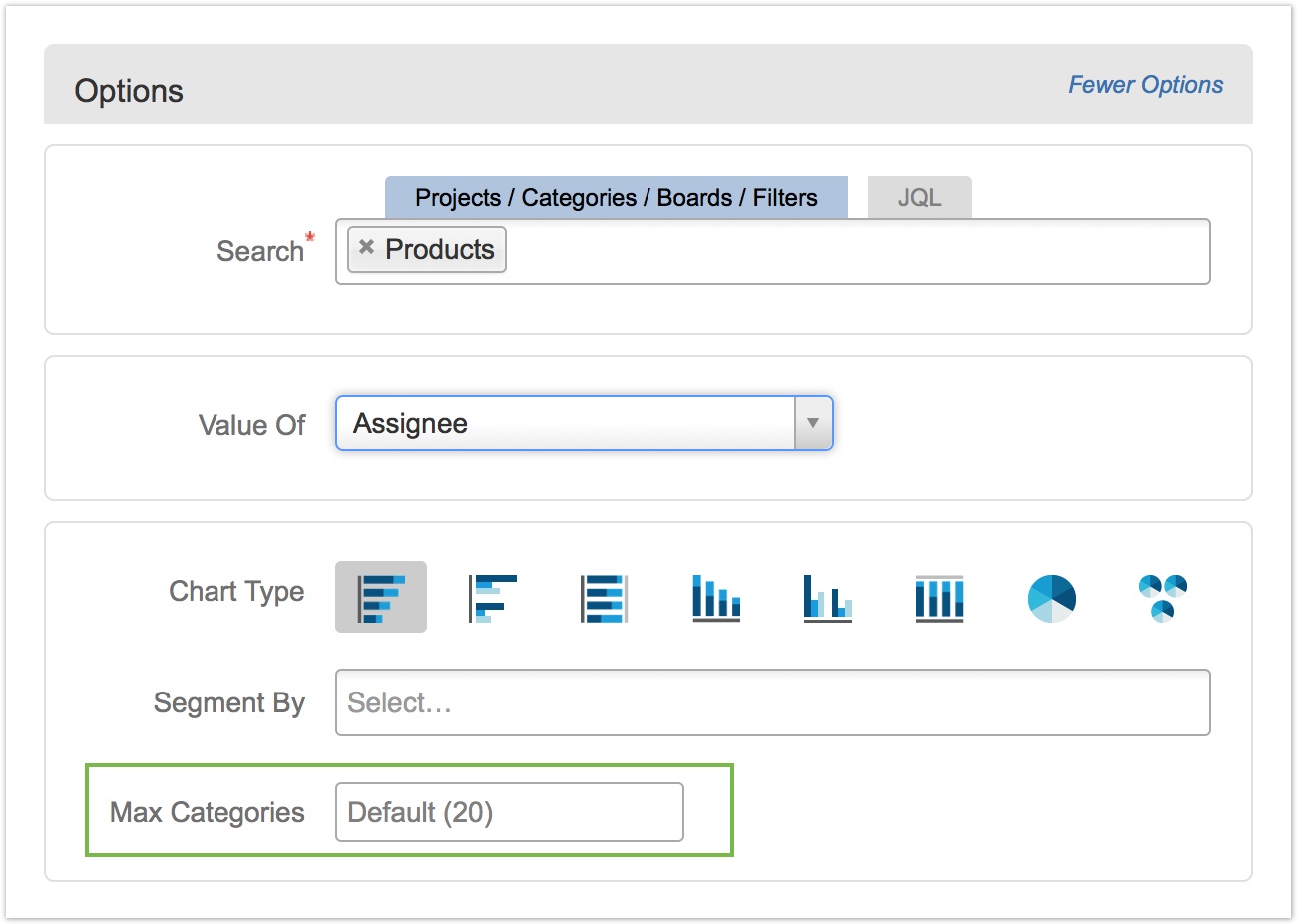
Limiting the Number of Categories Displayed
For non-historical reports, including the Current Issue Values report, and reports in the Current Metrics category, use the Max Categories option to configure the maximum number of domain categories to display in the chart.
By default, Dataplane displays up to 20 distinct categories in the report, corresponding to those categories containing the largest number of issues (or sum values). Any domain categories over the Max Categories value are aggregated into a single category labeled "Other".
The following example shows a report where Max Categories has been set to five (5). The remaining categories are all included in "Other".
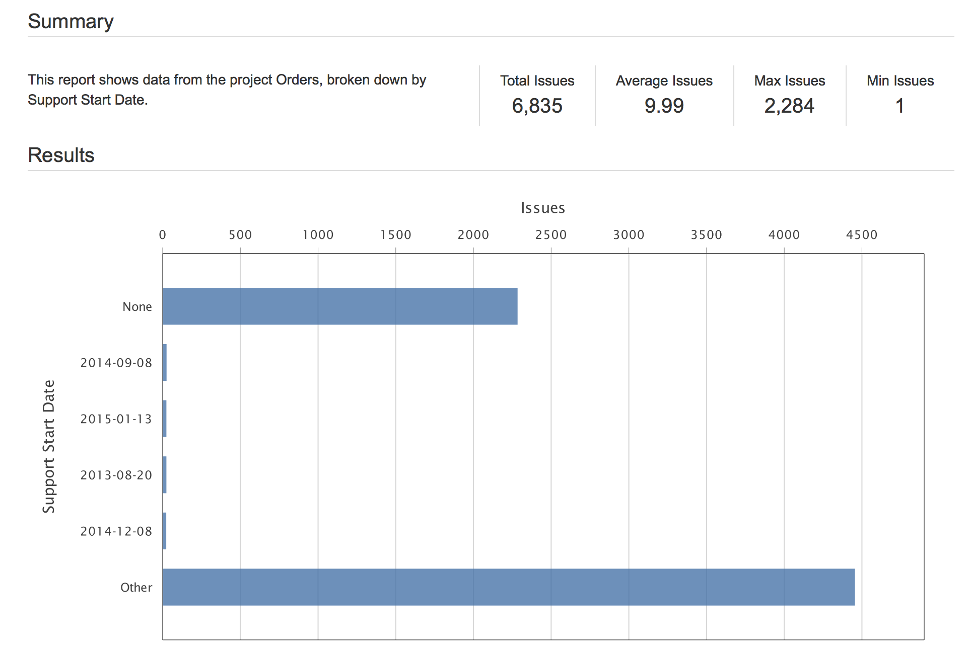
When report results display an "Other" category into which multiple categories have been aggregated, click the Data results tab to see a complete set of results data including all distinct, underlying categories.
Advanced Configuration Options
Click on the More Options link in the top-right corner of the report configuration to access additional, advanced configuration options.
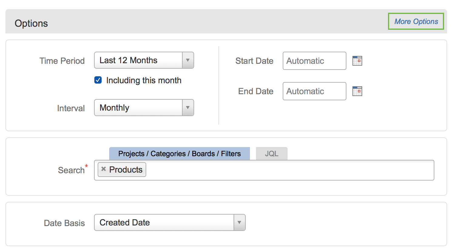
Clicking on More Options displays options for report descriptions, statistics, plotting in-chart data values, and Customizer Scripts, as shown here:
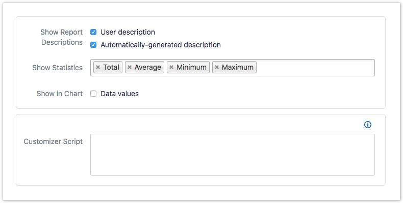
Configuring Report Descriptions
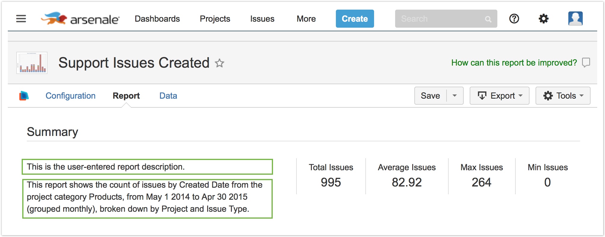
The Show Report Descriptions option in the More Options section allows you to configure the display of the two descriptions associated with each report.

The User description is blank by default, but it can be configured using the Description field in the Tools » Edit Properties dialog, or in the Description field when saving a report for the first time. A report must have been saved to enter a user description.
The Automatically-generated description is generated by Dataplane every time the report is run. This description includes information about the report itself, any options selected, the time range, and so on.
Any user description provided is always displayed first.
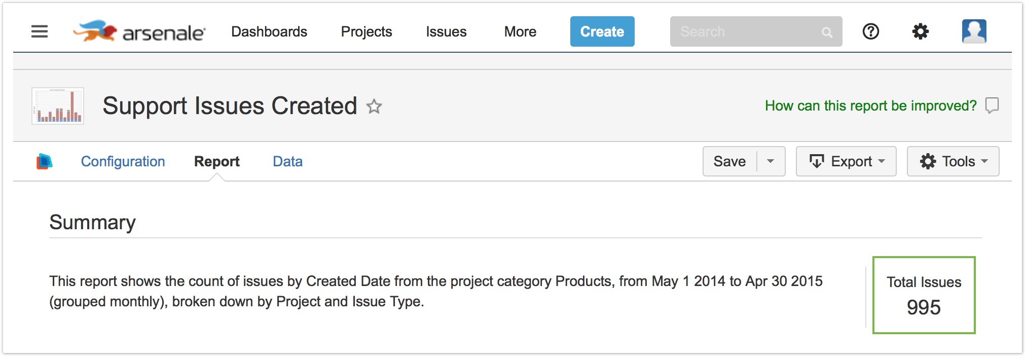
Configuring Statistics
Use the Show Statistics dropdown to add or remove any of the report statistics that you wish to display in the Summary section of your report. Not all reports have statistics available.
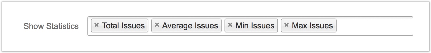
The following example showed the report output when only the Total Issues statistic was selected and all other statistics were excluded:
Displaying In-Chart Data Values
By default, the rendering of Dataplane charts is optimized for web browser display where hovering over charted data segments pops up information tooltips showing the associated numbers. However if your primary sharing of a Dataplane report is non-interactive, such as by report subscription, by exported PDF file, or on an office wallboard, it can be useful to have Dataplane automatically annotate the chart with the values represented by the plotted data.
To show report result data values within the chart, select Data values for the Show in Chart report configuration option:

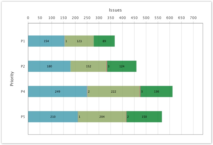
Here's what a chart looks like with this option selected:
Configuring Customizer Scripts
Report Customizer Scripts allow you to customize your reports programmatically. Easily change series names and colors, modify chart axes, add goal lines, and more.
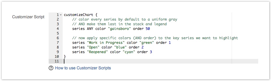
See Customizing Reports with Scripts for a complete description of this powerful customization feature.
Running a Configured Report
Once you have filled in all of the required parameters, click the Run Report button to execute the report. Dataplane Reports will perform the required calculations and display the requested data.
Changing Configuration Options
To select different report configuration options and re-run the report, click the Configuration tab, which will switch the page back to the configuration panel. You may switch back and forth between the Configuration, Report, and Data tabs at any time without losing information.
After you have made changes on the Configuration tab, you can click Run Report again to re-run the report and see the new results, and optionally click the Save button to update your saved report.
Page Contents